The Story of Super Symbol: How It Carries Strength & Freshness
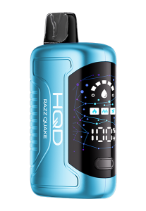
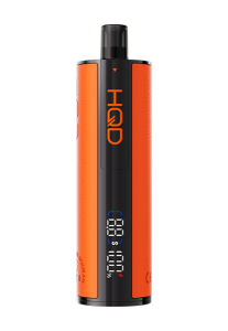
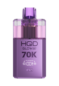
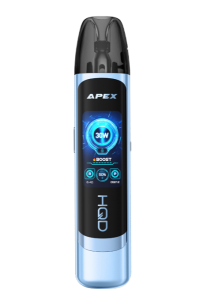
n this moment of vibrant rebirth, HQD is stepping forward with a bold brand‐refresh that marries vibrant and quality. As we unveil our visual identity, we’re excited to introduce our new super symbol that is the essence of our brand style.
What is HQD super symbol
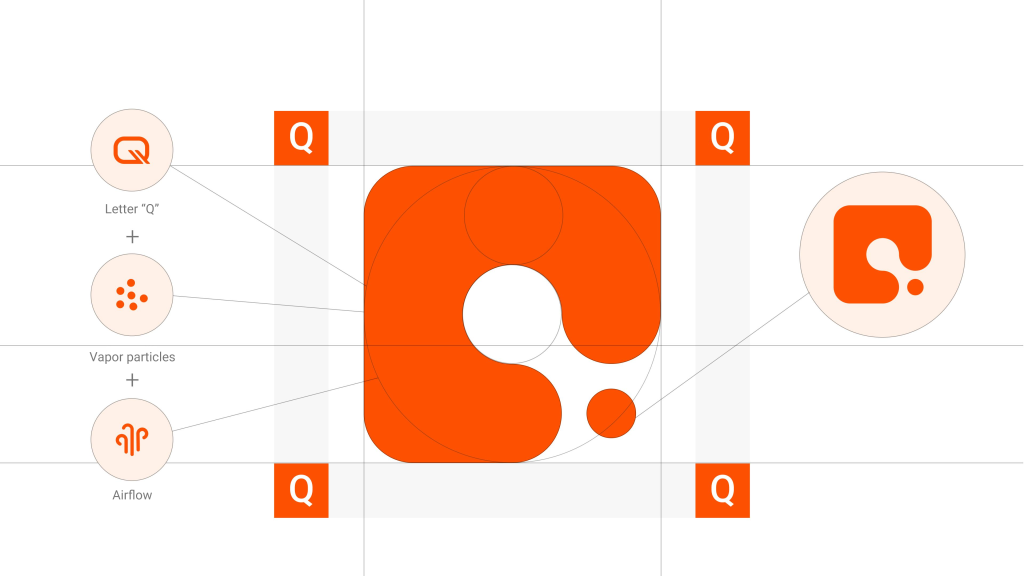
At the heart of our symbol lies the letter “Q”. We took the “Q” from HQD and reimagined it: the outer shape is squared, its geometric structure signifying intelligence; the inner is a circle, embodying openness. The overall design features curved lines, giving it a flow and motion.
The hollow interior of the square frame creates the Q-shape, while also incorporating the concept of airflow, resembling the trajectory of an expelled stream of air, which matters in every puff. The round dot of the symbol shifts into a stylised smoke particle, the tiny element that features flavor, presence and experience in every vape.

The entire mark is soft at the edges, yet energetic—rounded contours meeting angular framing—so you feel the strength and freshness. It speaks to the world of vaping, of e-cigarettes, yet carries a sophisticated brand aesthetic.
Strength & freshness in one symbol
The refresh HQD is full of energy and vitality, and freshness is at the heart of this super symbol. The circle within, the airflow curve, the smoke particle — these introduce movement, life, and a breath of newness. The visual suggests a continuous flow and a smooth draw. In the world of vape, freshness matters: every inhale should feel smooth, vibrant, alive.
Its core framework, Q, represents HQD’s relentless spirit of exploration, which is underpinned by its powerful capabilities. Its strength is also reflected in the squared exterior—engineered devices, durable performance, and reliability behind every vape. And the clean geometry hints at rational design and robust build.
Behind the symbol
What powers the design is our brand spirit: humanity, quest and devotion. Behind this symbol of strength and freshness, we hope it is not a cold graphic, but a technological aesthetic expression about experience, perception, and emotion. Enjoy vaping becomes more than a tagline—it becomes a promise. In every puff, the inner curve of the “Q” guides the air, the dot sits like a particle of possibility, and the outer square frames your journey.
We hope that when you see the mark, you feel ready for the next generation of vaping. Whether you’re browsing for the best vape, seeking smooth device performance, or simply drawn to thoughtful design, welcome to HQD’s new chapter. Welcome to a visual and sensory journey where strength meets freshness—and where every puff carries our purpose.


