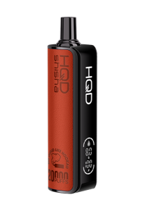
Why HQD Chooses Bright Orange: The Color of Freshness, Energy & Healing
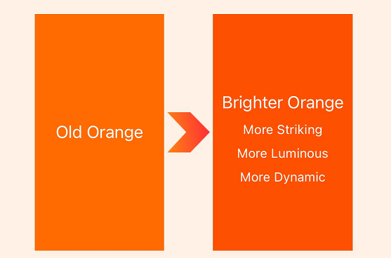
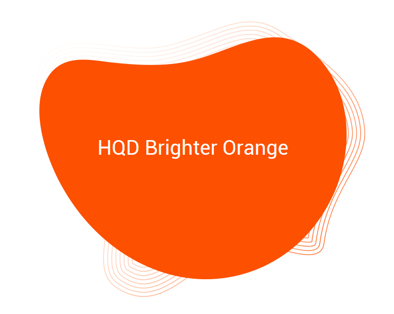
HQD’s brand renewal is a bold recommitment to who we are and what we stand for. Our new, vibrant orange hue isn’t just a color; it’s a signal of freshness, energy, and healing in every interaction.
Freshness: A Zest for What’s Real
Bright orange captures the essence of “freshness”—a core pillar of HQD’s brand renewal identity. Picture the burst of a sun-ripened tangerine. This color embodies purity, authenticity, and vibrancy. For HQD, it’s a promise: high-quality products, innovative experiences, all genuine, all fresh.
Energy: Ignite Your Daily Spark
Our new orange radiates energy, like the warm glow of a sunrise. It replaces the old muted tone with something invigorating—the spark of connection and daily motivation. HQD aims to energize your life, whether through our products for productivity or moments of inspiration. This reflects our brand’s evolving spirit, encouraging engagement and vitality in a fast-paced world.
Healing: A Warm Embrace
Bright orange also carries a deeper warmth—a nod to healing and care. Nestled between soothing yellow and fiery red, it strikes a balance of comfort and optimism, reflecting HQD’s commitment to your well-being. In a world that often feels overwhelming, our orange is a gentle reminder to pause, breathe, and reconnect. It’s the warmth of a moment of self-care, the glow of feeling understood. From our thoughtfully designed products to our community-driven initiatives, HQD’s bright orange wraps you in a promise: we’re here to support you, mind and soul.
A Color That Lives Everywhere
You’ll see this vibrant orange woven into every corner of HQD’s world. Our revamped website glows with it. Our packaging pops with this color, making every unboxing a moment of joy. From sleek brochures to posters, every touchpoint reflects a brand that’s rediscovered its purpose while staying true to its roots.
More Than a Color, It’s Our Promise
HQD’s bright orange is more than a hue—it’s a declaration that we’re fresh, energized, and deeply committed to your journey. It’s a color that doesn’t just catch your eye; it captures your spirit. Welcome to the new HQD—vibrant, purposeful, and here for you.